A compiler for design systems
An experiment I finally had time to run: describe a design system once, compile native themes for every ecosystem you ship in. What it is, how it works, and what four real systems look like coming out the other end.
First, what this actually is
I have had this idea for years. Every time I met it again — at work, where design systems are my job; in Bootstrap, where I maintain one of the frameworks this thing now compiles for; in the various tools and contributions that fill the rest of the week — I thought somebody should build that, and then life carried on. Evenings and weekends are not where a compiler gets written. So the idea stayed an idea, for a very long time.
This is the experiment I finally ran, and I ran it with Claude. Transtyle is vibe coded: I brought the architecture, the design-system judgement and the arguments, and an AI wrote most of the lines. That is worth saying plainly for two reasons.
The first is that it inevitably contains AI slop. There is code in here I would have written differently, comments that are longer than they need to be, and abstractions that exist because they seemed reasonable at 11pm. I am not going to pretend otherwise, and I would rather you find it knowing that than find it thinking a team of five spent a year on it.
The second is that the result is genuinely encouraging — encouraging enough that I want other people to look at it. This is something I could not have built alone. Not because the ideas were beyond me, but because the sheer volume of it — eight exporters against real framework surfaces, a derivation engine, thirty-two runnable demos, a conformance kit, the checks that hold it all together — is hundreds of hours I was never going to have. The experiment was as much about whether that kind of project is now reachable for one person with a day job as it was about design tokens.
It turns out it is. So here is what came out.
The problem, in one paragraph you can verify yourself
Your brand blue lives in six places.
It is a hex value in Figma. It is $primary in a Bootstrap Sass override. It is --primary in a
shadcn globals.css, twice — once for light mode, once for dark. It is color[0] in an ECharts
theme JSON. It is colorPrimary in a Storybook manager config. Somewhere there is a .docx brand
book with the same hex printed under a paragraph nobody reads.
Change the blue, and you have six pull requests, five reviewers who each know one framework, and one of them will be missed. Six months later nobody can say which copy is authoritative — only which one is on production.
That is the tax. Every organization with more than one front-end framework pays it, forever, and it is nobody’s job because it is everybody’s.
The shape of the problem
The tax is not a discipline failure. It is arithmetic. With N design systems and M target ecosystems, hand-maintained theming costs N × M mappings — and every framework upgrade invalidates a column.
This is the oldest trick in compiler engineering. Machine translation between twenty languages does not hire translators for four hundred language pairs; it translates through a pivot. Babel does not have a converter per syntax pair; it parses to one AST. LLVM does not have a compiler per language-and-chip combination; it has frontends, an intermediate representation, and backends.
Transtyle applies that architecture to design systems. You describe your system once, in standard W3C design tokens. It compiles native theme files for each ecosystem you target.
That is the whole idea. Everything below is either a demonstration of it or an argument about the parts that are hard.
Watch it happen: three files in, nine themes out
Enough prose. Here is the worked example that ships in the repository, start to finish. You can run every command in this section yourself.
What you write
A config that names your token files, your modes, and the targets you want:
{
  "name": "acme-design-system",
  "tokens": ["tokens/option.tokens.json", "tokens/semantic.tokens.json"],
  "modes": {
    "color-scheme": { "values": ["light", "dark"], "default": "light" }
  },
  "derivation": { "rules": "standard@1" },
  "targets": {
    "shadcn": { "output": "dist/shadcn", "options": { "era": "tailwind-v4" } },
    "bootstrap": { "output": "dist/bootstrap" },
    "echarts": { "output": "dist/echarts" },
    "primeng": { "output": "dist/primeng" }
  }
}
Your raw values, in plain DTCG — this is a valid design-token file, readable by Figma, Tokens Studio and Style Dictionary, with no proprietary format to migrate into:
{
  "option": {
    "color": {
      "$type": "color",
      "white": { "$value": "oklch(1 0 0)" },
      "blue": {
        "600": { "$value": "oklch(0.55 0.18 255)" }
      },
      "gray": {
        "50": { "$value": "oklch(0.985 0.003 255)" },
        "900": { "$value": "oklch(0.22 0.012 255)" }
      }
    }
  }
}
And a second file saying what those values mean, which is the only part that is Transtyle-specific — and even that is expressed as ordinary DTCG aliases:
{
  "semantic": {
    "color": {
      "$type": "color",
      "primary": { "solid": { "$value": "{option.color.blue.600}" } },
      "text": {
        "base": {
          "$value": "{option.color.gray.900}",
          "$extensions": {
            "transtyle.modes": { "color-scheme": { "dark": "{option.color.gray.50}" } }
          }
        }
      }
    },
    "radius": { "md": { "$type": "dimension", "$value": "0.5rem" } }
  }
}
That is the shape of the whole input. In full, the Acme example authors 40 tokens, and the compiler resolves them into 271 slots per mode — every hover shade, every readable foreground, every step of the dark mirror, filled in by rule.
What you run
npm i -D @transtyle/cli
npx transtyle init      # scaffold a config and a starter token file
npx transtyle add bootstrap
npx transtyle build
What comes out
The real output of npx transtyle build in examples/acme, unedited:
$ npx transtyle build

ℹ TST1204 semantic.color.primary.solid has no authored value for color-scheme=dark — the light-mode
  value carries over unchanged, and so does its whole derived grid

shadcn  42% native · 53% derived · 3% approximated · 3% dropped
  ↳ dist/shadcn/globals.transtyle.css
  ↳ dist/shadcn/usage.md
  ↳ dist/shadcn/report.json

bootstrap  8% native · 69% derived · 5% approximated · 10% dropped · 8% unsupported
  ↳ dist/bootstrap/_variables.transtyle.scss
  ↳ dist/bootstrap/_maps.transtyle.scss
  ↳ dist/bootstrap/bootstrap-theme.css
  ↳ dist/bootstrap/usage.md
  ↳ dist/bootstrap/report.json

echarts  45% native · 18% derived · 18% approximated · 9% dropped · 9% unsupported
  ↳ dist/echarts/theme.acme-design-system-light.json
  ↳ dist/echarts/theme.acme-design-system-light.js
  ↳ dist/echarts/theme.acme-design-system-dark.json
  ↳ dist/echarts/theme.acme-design-system-dark.js
  ↳ dist/echarts/usage.md
  ↳ dist/echarts/report.json

primeng  69% native · 19% derived · 3% approximated · 0% dropped · 9% unsupported
  ↳ dist/primeng/preset.transtyle.ts
  ↳ dist/primeng/usage.md
  ↳ dist/primeng/report.json

✔ build complete
Every one of those files is the kind of file a practitioner in that ecosystem already knows. The
shadcn one is a Tailwind v4 globals.css:
:root {
  --radius: 0.5rem; /* radius.md */
  --background: oklch(1 0 0); /* color.elevation.0.surface */
  --foreground: oklch(0.22 0.012 255); /* color.text.base */
  --primary: oklch(0.55 0.18 255); /* color.primary.solid */
  --primary-foreground: oklch(1 0 0); /* color.primary.on-solid · derived */
  --muted-foreground: oklch(0.55 0.012 255); /* color.text.muted */
  --accent: oklch(0.95 0.017 255); /* color.accent.tint · derived */
  --destructive: oklch(0.55 0.19 25); /* color.danger.solid · derived */
}
The Bootstrap one is Sass variables, imported the way Bootstrap’s own documentation tells you to:
// GENERATED by transtyle — do not edit; source: acme-design-system token files
$primary: #026fd7;
$secondary: #617c9f;
$success: #319751;
$info: #0088c1;
$warning: #daa932;
Note the trailing comment on every custom property, and the fact that four of those five Bootstrap
colours were never authored by anyone. $primary is the one blue in the token file. The rest were
computed — and the report will tell you exactly how.
Adding a target is one line
The nine targets in the full example are nine entries in targets. Adding the tenth ecosystem you
ship in is a line of config and a rebuild; there is no second definition of your design system to
keep in step, because there was never a first one specific to a framework.
npx transtyle add radix        # writes the config entry
npx transtyle build            # every target, from the same tokens
npx transtyle check            # every target, without writing anything
check is build with the writing stage skipped — the same numbers, safe to run in CI on every
pull request:
$ npx transtyle check

shadcn         42% native · 53% derived · 3% approximated · 3% dropped
shadcn-v3      42% native · 53% derived · 3% approximated · 3% dropped
echarts        45% native · 18% derived · 18% approximated · 9% dropped · 9% unsupported
daisyui        17% native · 65% derived · 9% approximated · 9% dropped
bootstrap       8% native · 69% derived · 5% approximated · 10% dropped · 8% unsupported
storybook      63% native · 19% derived · 13% approximated · 6% dropped
css-variables  100% native
radix          41% native · 58% approximated · 1% dropped
primeng        69% native · 19% derived · 3% approximated · 9% unsupported

✔ check passed
Hold that output in mind — we will come back to why a compiler that tells you it only mapped 8% of something natively is the honest one in the room.
Four design systems, thirty-two running demos
The claim so far is a claim about what things look like, and prose is a bad medium for it. So all 32 demo projects in the repository are deployed and running in a browser: four design systems, eight targets each, rebuilt from the token files on every deploy.
Start here: the demo gallery.
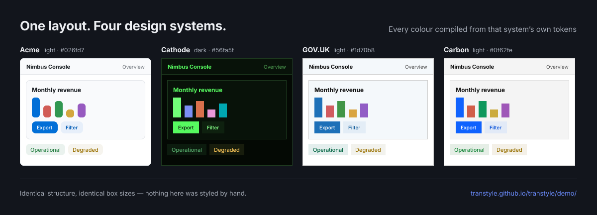
npm run gen:figures and regenerated whenever the tokens move, so it cannot quietly go stale. The typeface is the one exception: it is Inter throughout, because the real ones are not mine to redistribute. For the real typography, open the demos.What does not change is the interesting part
Each demo is the same fake admin page — Nimbus Console — built with a target’s real components. Acme’s Bootstrap demo and Carbon’s Bootstrap demo are not two pages that happen to resemble each other. They are the same source files, byte for byte, and a CI check fails the build if one of them drifts. That check exists because the drift already happened once: a tooltip was added to Acme’s demo and to nobody else’s, and three files went out of sync before anyone noticed.
Which means the comparison is clean. Open Acme on Bootstrap, then use the switcher in the corner to jump to Cathode. Every single thing that changed — the colours, the corner radii, the type, the hover states, the focus ring, the dark mode — came out of the compiler, from a different set of token files. Nothing else could have changed it, because nothing else is different.
Then go the other way: from Cathode’s Bootstrap page to Cathode’s PrimeNG page. Same design system, different ecosystem, different framework, different component library, different language even — Angular rather than a Vite bundle. It still looks like Cathode.
The four systems, and why each one is there
They were chosen to disagree with each other.
Acme — invented, minimal
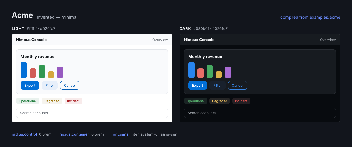
examples/acme. Its one authored radius is 0.5rem, and it is the only one of the four with rounded corners.The ordinary case, and the baseline every other column is a departure from: one brand blue, a few neutrals, one radius. Most of what you see in its demos was derived rather than authored — the dark mode, the hover shades, the chart palette, the readable foreground on every coloured background. It is the system this post’s worked example uses.
Acme demos → · all eight targets
Cathode — invented, hostile
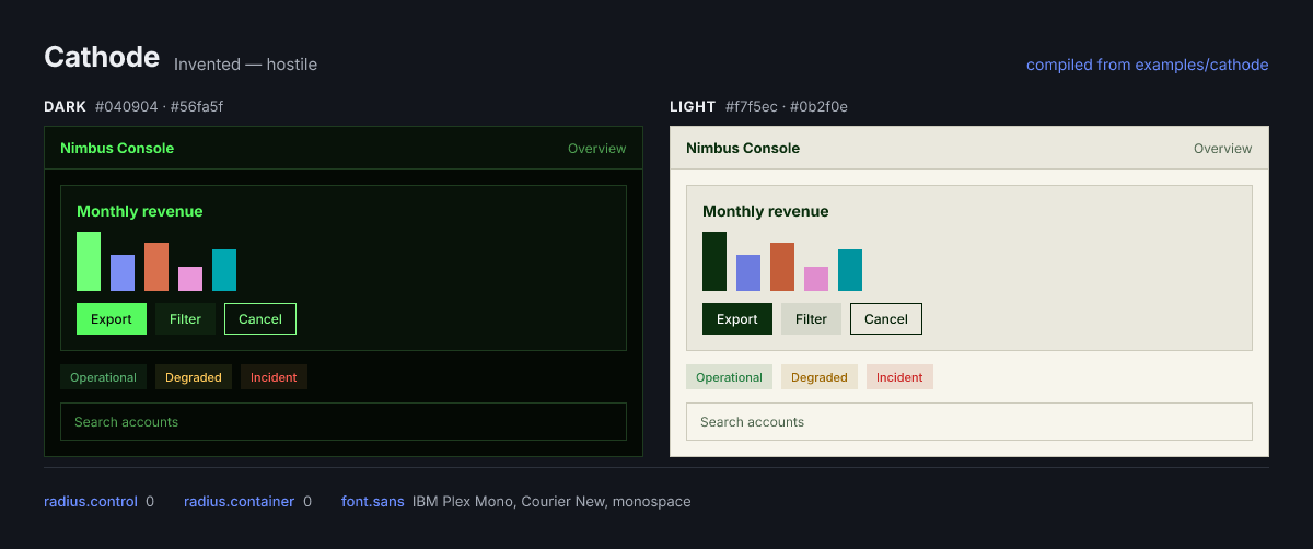
A retro CRT terminal system, built specifically to break assumptions. Its vocabulary has no
“primary” in it — the tokens are called crt.ink, crt.tube, crt.glass. It is dark-native, so
light mode is the paper-printout mode, and the compiler has to carry that round the right way when
it emits into shadcn’s light-first :root / .dark structure. Its brand colour is also its text
colour. Its radius is zero, which makes shadcn’s calc(var(--radius) - 4px) negative, which browsers
clamp to zero — brutalism by accident of CSS.
If Transtyle only worked on systems shaped like Acme, Cathode is where you would see it fail.
GOV.UK — real, public sector
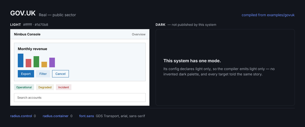
The UK government’s design system — a real, published system that nobody on this project designed.
It was adopted through the binding layer: its published colours and its own
functional-colour names stay exactly as they are, and a small file states what they mean. Its
error colour becomes the catalog’s danger role with one alias, and everything downstream follows.
It ships no dark theme, so its config declares one mode and every surface says so rather than inventing one. A compiler that fabricates a mode nobody designed is a compiler you cannot trust about the modes it did not fabricate.
GOV.UK demos → · the full showcase
Carbon — real, enterprise
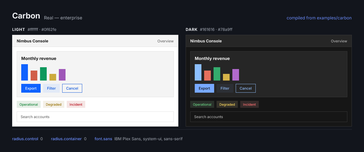
IBM’s Carbon Design System, bound the same way, and the case where the compiler has to stop deriving: Carbon publishes real per-theme values, White for light and G100 for dark, so those are what the output carries. Where its dark theme reuses a light value, the build says so in an informational note instead of hiding it.
The GOV.UK and Carbon demos are independent demonstrations of Transtyle compiling publicly available design tokens. They are not affiliated with, endorsed by, or produced in collaboration with the UK Government Digital Service or IBM.
The eight targets
Every one of the four systems above compiles to every one of these, and each cell of that grid is a running page you can open:
| Target | Stack | What the demo shows |
|---|---|---|
| shadcn/ui | React · Tailwind v4 | Real shadcn/ui registry components, themed by the generated globals.css |
| daisyUI | Tailwind v4 | Both modes registered natively as daisyUI themes via generated @plugin blocks |
| Apache ECharts | ECharts 5 | A chart dashboard — the data-viz palette derived from the same one brand colour |
| Bootstrap | Bootstrap 5.3 · Sass | The Sass path: .btn-primary and friends compiled from the theme, not overridden |
| Storybook | Storybook 9 | Storybook’s own chrome — sidebar, toolbar and panels wearing the theme |
| Radix Themes | React · @radix-ui/themes | Compiled 12-step scales overriding a stock Radix preset in place |
| PrimeNG | Angular 22 | A typed PrimeNG preset, checked against PrimeNG’s own DesignTokens types |
| CSS variables | No framework | Every catalog slot as a plain custom property. The reference dump |
The gallery is compiled too
The swatches on the gallery page are not hand-picked hexes that resemble the output. Every colour,
corner radius and typeface on that page — and in the four figures above — is read out of a live
compile of the four examples. Change option.color.blue.600 in examples/acme and the gallery card
moves along with the demos it links to, or the build fails saying which slot went missing.
That is the same rule the docs already follow for numbers: nothing on this site claims something about the compiler that was not asked of the compiler while the page was being built.
What publishing them cost, and what it caught
The whole publishing step is under a minute of CI: 32 static builds, 33 MB, no build matrix and nothing cached. Each demo is built with the same command a contributor runs, plus one argument that makes its asset paths relative so it works from a subdirectory rather than a server root.
Publishing them surfaced four defects that local development had been hiding, which is the usual reward for deploying something:
- The Angular demos referenced
/favicon.svgfrom the server root — invisible locally, a 404 under any subdirectory. There is now a check that fails assembly on any root-absolute reference in a built demo. - The Storybook demos pointed their brand image at a
/logo.pngthat has never existed anywhere. - GOV.UK’s and Carbon’s Storybooks were both listening on Acme’s port, so two of them could not run at once — while their READMEs, the docs and the editor config all named three different ports.
- Three of the four demo READMEs said “seven projects” and had no PrimeNG row, months after PrimeNG shipped.
The last two were found by a new checker rather than by reading, which is the point of writing
checkers: the demo table now has to match the directory it describes, and the ports have to match
the package.json that opens them.
Is this actually new?
That question deserves a straight answer, because “new” is the cheapest word in software.
What is not new: design tokens as an idea (a decade old). The DTCG format (a W3C community group standard; Transtyle’s input files are valid DTCG plus namespaced extensions, so Figma, Tokens Studio and Style Dictionary can read them unchanged — there is no proprietary format to migrate into). Token pipelines — Style Dictionary has been transforming token files into platform outputs for years, and Terrazzo does it DTCG-natively with a clean plugin model. Per-framework theme generators exist for nearly every target listed above. And the compiler metaphor itself is borrowed shamelessly from Babel and LLVM.
The existing pipelines solve the bottom half of the problem beautifully: given token files, produce variable files. What none of them do is the top half — understand what a design system means, and produce configuration that a specific framework actually consumes.
That gap has four parts, and each one is a falsifiable claim rather than a slogan.
1. A pivot vocabulary of meanings, not names
Style Dictionary will happily emit --color-brand-blue-600 for every platform you ask. It has no
opinion about which of your tokens is “the danger color”, because it has no vocabulary for danger.
Transtyle’s catalog is that vocabulary: a fixed set of semantic slots —
primary.solid, danger.on-tint, elevation.3.surface, text.muted — that exporters bind to.
Your names map into it once; each framework’s names map out of it, maintained by people who know
that framework.
your semantics            the catalog (pivot)          each library's semantics
──────────────            ───────────────────          ────────────────────────
"brand-action"   ─alias→  primary.solid        ─table→  --primary        (shadcn)
"flame-soft"     ─alias→  primary.tint         ─table→  $primary-bg-subtle (Bootstrap)
(nothing)        ─rule──→ primary.on-solid     ─table→  --primary-foreground
The reason this has to exist — and the reason a simple rename table cannot replace it — is false friends. The same word means different things in different ecosystems:
| Word | In the catalog | In shadcn | In Bootstrap | In Radix |
|---|---|---|---|---|
| secondary | your second brand color | a subtle gray button surface | a theme color (close to ours) | — |
| accent | brand emphasis color | a hover-highlight tint | not a concept | the only brand color (≈ primary) |
| subtle | <role>.tint — one wash, all states |
muted, a surface + foreground pair |
-bg-subtle / -border-subtle |
steps 3–5, a range of values |
Bind Bootstrap’s secondary to shadcn’s secondary because they are spelled the same and you have
shipped a bug. Bind both by meaning through a pivot, and the collision becomes harmless. This is why
the catalog was designed from a comparative study of 14 ecosystems rather than reverse-engineered
from whichever framework I happened to like — a vocabulary shaped like one library’s internals is
that library’s config file wearing a neutral name.
The shape that study produced is the part experts should poke at hardest. Colors are not a flat list of roles; each role is a grid — prominence crossed with interaction state, plus paired foregrounds:
prominence →   solid            tint            outline          text
rest           solid            tint            outline          text
hover          solid-hover      tint-hover      outline-hover    text-hover
active         solid-active     tint-active     —                text-active
selected       solid-selected   tint-selected   —                —
on-colors      on-solid         on-tint         —                —
Radix’s 12 steps, Ant Design’s map tokens, Bootstrap’s subtle triad, Chakra’s colorPalette and
Material 3’s container/on-* pairs are all differently-named samples of that same grid. Once you
see it, you cannot unsee it — and once you encode it, an exporter for a system you have never heard
of is a mapping table, not a research project.
2. Derivation as a compiler stage
A real framework needs far more values than any human wants to author: hover shades, pressed shades, a readable foreground for every colored background, tinted washes, focus rings, the whole dark-mode mirror, an eight-color chart palette.
Transtyle computes them, from the decisions you did make, with fixed, versioned, published rules. Not AI, not “smart defaults” — arithmetic in a perceptual color space, the same input producing the same output byte for byte, forever. (The compiler being vibe coded and the compiler being deterministic are unrelated facts: an AI wrote the rules, and then the rules run without one.)
Two properties keep that from being a black box. First, authored always wins: every derived value is a proposal, and authoring the token — down to one dark-mode hover shade — makes the rule step aside. Second, every value can explain itself:
$ npx transtyle explain semantic.color.primary.on-solid

semantic.color.primary.on-solid = oklch(1 0 0)  [#ffffff]
 └─ derived by rule contrast-pick@standard@1
    inputs: semantic.color.primary.solid = oklch(0.55 0.18 255)  [#026fd7]
     └─ aliased → option.color.blue.600
That is the whole audit trail for one value: which rule, from which of your tokens, in what order. A designer can read it without reading any code. An accessibility reviewer can check that the white-on-blue pairing was chosen for contrast, not picked by eye. Nobody has to trust me — the trail is in the build output.
3. Lossiness measured instead of hidden
Translation between real ecosystems is lossy, in ways that have nothing to do with effort. A rem
radius has to become a pixel number in an ECharts theme JSON. Radix models each color as twelve steps
plus a parallel alpha ramp — a shape no other system carries the information to reconstruct exactly.
Some values simply have no destination.
Every tool in this space faces that. Most respond by quietly emitting something plausible. Transtyle grades itself instead — per variable, every build:
- native — the target has a first-class slot; the mapping is lossless
- derived — synthesized by a named rule, then mapped natively
- approx — mapped, but the meaning bent to fit; the reason is recorded
- dropped — this target simply cannot say it; omitted with a note, never faked
- unsupported — the target has a themable slot we do not cover yet; an admission on the record
Here is the real GOV.UK Design System — a public system nobody on this project designed — compiled to all eight targets:
native — losslessderived — computed by a ruleapproximated — meaning bent, reason recordeddropped / unsupported — this target can't say it
Read the shape, not a single number — and never compare one target’s bar to another’s. Each measures
a different surface with a different ceiling. css-variables is 100% native because it is the
conformance dump: it has a slot for everything by construction. radix is 58% approximated because
its 12-step alpha ramps are a fixed projection rather than a colorimetric reconstruction — a
compromise stated out loud. And bootstrap is 2% native / 76% derived across 712 classified rows
because GOV.UK authored a handful of colors and the standard rules coherently filled a very large
variable surface from them. A high derived share is not a weakness; it is the compiler doing the work
you did not want to do by hand, and telling you it did.
And the compromises are not summarized away into a percentage. Each one carries its reason, verbatim,
in report.json:
| Target | Item | Grade | The note, as written by the exporter |
|---|---|---|---|
| echarts | tooltip.borderRadius |
approximated |
rem → px (base 16) |
| radix | --primary-a4 |
approximated |
fixed alpha ramp, not a colorimetric derivation of Radix’s real per-color alpha |
| echarts | series-specific styles (candlestick, …) | unsupported |
beyond catalog semantics; extend the emitted theme manually |
That last row is the interesting one. It is a tool writing down, in its own output, something it cannot do — and shipping it to you anyway.
A build is not “done” at 100% native — that is impossible across real ecosystems. It is done when the report matches your intent: your decisions authored, coherent derivation for the rest, every compromise known and accepted. The report is the product. Everything else is plumbing.
4. Native artifacts, all the way down to components
The last difference is the least glamorous and the most load-bearing: what lands on disk.
A generic pipeline emits variables and leaves you to wire them up. Transtyle emits
_variables.transtyle.scss and _maps.transtyle.scss that import around Bootstrap’s own Sass build
the way Bootstrap’s docs tell you to; a globals.transtyle.css with @theme inline that drops into
a Tailwind v4 shadcn project; an ECharts theme JSON that registers directly. Delete Transtyle
afterwards and the files still work — there is no runtime, nothing shipped into your application,
no dependency to audit.
That extends past the color-role layer into component theming, which is where “themed” usually stops being true. Bootstrap exposes 952 themable Sass variables, 657 of them component-scoped; PrimeNG’s Aura preset exposes 2,759 design-token slots across 98 families. Both inventories are checked into the repository and drift-guarded in CI, and every single slot is accounted for in the coverage report — driven by a token, inherited through the target’s own chaining, left on its default, or honestly reported as a gap with a note.
The component tier is also where a distinction most token formats cannot express becomes one authored line:
author component.control.radius  →  buttons AND inputs move    ("controls are rounder")
author component.button.radius   →  only buttons move          ("buttons are pills")
Two targets that model this in incompatible ways still reproduce the distinction: Bootstrap chains
buttons and inputs through a shared $input-btn-* root, PrimeNG keeps button.* and formField.*
entirely separate. One line, a pill button in both, and form fields untouched in either.
The catalog does not grow to swallow all of that, and the rule for when it may is deliberately severe: two independent exporters must need the identical thing for architectural, not nominal, reasons. Control padding and radius passed — Bootstrap and PrimeNG both couple a button’s box to a form field’s box, arrived at separately. The small/large size ladder failed: both have one, and they disagree about which rungs it has. The disagreement is the finding. Everything a single target needs stays inside that target’s exporter, where it belongs.
Where this could be wrong
An honest post includes the parts that could fail.
The catalog is a bet that these meanings are genuinely universal. It survived two real, independently-designed systems (GOV.UK and IBM Carbon) compiling to eight targets with zero catalog amendments and no warnings or errors — Carbon draws a few informational notes where its dark theme reuses a light value, which is the compiler saying so rather than hiding it. But two systems is not many, and the ones that will break this are the ones I have not seen. Translation stays lossy no matter how good the reports get; if you need pixel-identical rendering across frameworks, no tool can give you that, and I say so rather than implying otherwise. The DTCG spec has not settled modes and theming upstream, so these extensions have to be deletable when it does. And the risk is not primarily engineering: it is whether an ecosystem that has been re-implementing themes by hand for a decade wants to stop.
How it works, in five schemas
Everything above rests on five ideas. If you read only this section, you will still be able to argue with me competently.
The pipeline
Every build runs the same six stages. Only one of them touches your disk.
| Stage | What happens |
|---|---|
| LOAD | Read the config and the token files it lists |
| NORMALIZE | Merge layers, resolve aliases (cycles detected), expand modes, parse colors to OKLCH |
| DERIVE | Fill every unauthored catalog slot with deterministic rules |
| RESOLVE | Map the completed token graph onto each target’s native theming surface |
| EMIT | Write native artifacts — the only stage that writes files; check skips it |
| REPORT | Classify coverage, raise diagnostics, emit report.json |
No network, no timestamps, no randomness: identical inputs produce byte-identical outputs, and CI proves it on every commit.
The three tiers
Exporters bind only to the semantic tier. Rename your entire raw palette tomorrow and no target output changes, as long as the semantic aliases still point somewhere sensible. If you run a design system, you already have these tiers; you probably call them primitives and aliases.
Modes
A mode is a declared axis of variation — color-scheme: light | dark is the familiar one, and a
second axis such as density composes with it. Every token resolves per mode, unspecified values fall
back to the default, and one rule matters more than it sounds: default declares your system’s
native mode. A dark-native design system still compiles correctly into shadcn’s light-first
:root / .dark structure, because the exporter binds mode names, not the assumption that light
comes first. That is Cathode’s entire reason for existing.
Provenance and coverage
Two orthogonal labels, which people conflate constantly. Provenance answers where did this value
come from — , aliased,
derived, or defaulted. Coverage answers how well did it survive
the trip into this target — the native/derived/approximated/dropped/unsupported classes above. A
value can be authored by you and still approximated on arrival, because the target cannot express
what you meant. Both labels sit on every row of every report.json.
The binding layer
This is the part that decides whether adoption takes an afternoon or a quarter. You do not rename anything. You keep your token files, your names, your Figma sync, your governance — and add a thin layer of one-line aliases stating what your names mean.
GOV.UK was adopted exactly that way. Their error colour becomes the catalog’s danger role with one
alias, and everything downstream follows:
$ npx transtyle explain semantic.color.danger.text

semantic.color.danger.text = oklch(0.488 0.167 25.6)  [#aa2729]
 └─ derived by rule contrast-pick(text)@standard@1
    inputs: semantic.color.danger.solid = oklch(0.558 0.186 25.6)  [#ca3535]
     └─ aliased → semantic.color.govuk.error
    inputs: semantic.color.elevation.0.surface = oklch(1 0 0)  [#ffffff]
     └─ aliased → semantic.color.govuk.body-background
Note what that trace shows: an accessible red for text was computed against the actual page background of that system, not against an assumed white. That is the difference between a translation layer and a search-and-replace.
Who this is actually for
If you are one person with a side project
Three tokens is a working design system here — a brand color, a page background, a text color. (Not a figure of speech: a CI check compiles exactly that three-token system against all eight exporters on every commit, because a tool that only works on lavishly-authored systems is a tool for people who already have a design system.) You get a complete, dark-mode-ready, contrast-checked theme for whichever framework you picked — plus the other seven, free, on the day you change your mind about the framework.
The real win is subtler: you get a coherent system without knowing color theory. Hover states that move the right amount. Foregrounds that pass WCAG AA because a rule checked, not because they looked fine on your monitor. A chart palette that is actually distinguishable. Things a design systems team would have given you, if you had one.
And the exit is free. The output is plain theme files; there is no runtime, no lock-in, and no import from us anywhere in your app. If you abandon Transtyle next year, you keep everything it wrote.
If you are a product team with more than one framework
The moment you have a Storybook, an app, and a dashboard with charts, you have the N×M problem in miniature — three theming surfaces, three dialects, one brand. This is where “regenerate everything from one source” stops being an abstraction and starts being the Tuesday afternoon you get back.
The generated files are disposable by design: check them in, never edit them, regenerate on change.
Because rebuilds are byte-identical, a token change shows up as exactly the lines it moved — and
transtyle diff reports it semantically, per target, against any git ref. That turns “we changed the
brand blue” into a reviewable pull request instead of an act of faith.
If you run a design system at a large organization
This is the case the project was built for, and it is less about convenience than about evidence.
- One source of truth that can prove it is the source of truth. Provenance turns “trust us” into a queryable chain, per value, per mode, per target. That is an audit artifact, and regulated organizations spend real money faking it today.
- Accessibility becomes a build step. Contrast is checked during compilation against the real
surface a value lands on, and failures are diagnostics with stable codes —
checkin CI, not a manual sweep before a release. - Framework migration stops being a project. Moving a product from one library to another begins with a recompile and a coverage report telling you precisely what will not survive, before anyone estimates the work.
- Federated teams stay federated. The catalog is a published interface. Your platform team owns the decision layer; product teams consume native artifacts in their own stack; nobody has to learn anybody else’s dialect. Exporters are plugins on a public API, so a team with an internal component library can write and own one without touching the compiler.
- Procurement-friendly by construction. MIT-licensed, local-first, no hosted service, no telemetry, no account, no runtime dependency entering your application’s supply chain.
- Agent-operable. JSON in, JSON out, stable diagnostic codes, deterministic builds. AI agents can drive the config; the compiler itself stays rule-based and auditable, which is exactly the boundary a serious organization wants between generated and guaranteed.
GOV.UK and IBM Carbon are in the repository as worked proof — not because anyone partnered with anyone, but because both publish their tokens, and a system you cannot compile without editing is a system you have not really adopted.
What it deliberately is not
Scope discipline is the survival strategy of a project like this, so the boundaries are permanent, not “not yet”:
- Not a component library. It generates configuration for other people’s components and ships no UI code.
- Not a design tool. It does not edit tokens visually; it reads the files your design tool already writes.
- Not a promise of pixel-perfect equivalence. The contract is measured fidelity, not false equivalence.
- Not a fork of your framework. If Bootstrap cannot express something, it is reported; nobody ships a patched Bootstrap.
- Not an AI theming assistant. Derivation is deterministic and inspectable. An agent can write the config; it will never be inside the compiler.
Where it stands, honestly
Transtyle is on npm: twelve packages under @transtyle, all
at 0.1.0-alpha, and the documentation you are reading is deployed rather than previewed on my
laptop. That is not a launch. It is the point at which the project becomes possible to try, which
is a different and much smaller claim.
Real today: the full pipeline; the derivation engine (role grids, elevation ladder, scales,
modes); build, check, explain, init, add, and diff — the last one comparing the compiled
themes against a git ref, so a token change arrives in review as “here is what moved, in every
target”; 8 exporters — shadcn/ui, daisyUI, Apache ECharts, Bootstrap, Storybook, Radix Themes,
PrimeNG, and plain CSS variables — all on the same public plugin API, with a conformance kit gating
them in CI; 4 example systems, two of them real and independently designed, with 32 runnable demo
projects rendering the compiled themes on each target’s actual components; component-tier theming on
Bootstrap and PrimeNG; JSON schemas for config and reports; zero runtime dependencies; byte-identical
rebuilds verified on every commit.
Specced but not implemented: preview, and import with the importers behind it — the reverse
direction that turns an existing Tailwind config, Figma variable set, or CSS custom-property sheet
back into tokens. The first release deliberately targets design systems that already speak DTCG. If
your tokens are not DTCG, the front door is shut for now.
What will break: everything, potentially, and without a deprecation cycle. That is what the alpha
label is for, and it is
written down
rather than implied: the token vocabulary, the generated output, the config format and the CLI surface
can each change between alpha releases. Two consequences worth acting on — pin an exact version
(@transtyle/cli@0.1.0-alpha.1, not a range), and treat generated files as output (regenerate
them; never hand-edit and keep them, because the compiler will happily overwrite your careful manual
fix, and that is the correct behaviour). The freeze arrives at the first release whose version carries
no prerelease identifier.
Not proven by anyone but me. Four examples and eight exporters is evidence, not adoption.
What happens next
I am going to keep working on this. The next stretch is not new features — it is more evidence: more design systems, of shapes I have not tried, compiled against more tools, to find out where the catalog bends and where it snaps. Every system that compiles cleanly is a small confirmation; the first one that does not is worth more than all of them, because it tells me something I could not have reasoned my way to.
Which is where you come in. The most useful thing anyone can do with this alpha is point it at a design system I have never seen and tell me what happened.
npm i -D @transtyle/cli
npx transtyle init
npx transtyle build
If you already have a design system, start at I already have a design system instead — the whole point of the binding layer is that you do not rename anything you already have. Or just look at the output first: the demo gallery has all 32 running.
Then tell me how it went in GitHub Discussions — what compiled, what did not, what the coverage report said, what the catalog could not express, what was obviously wrong. Bug reports are welcome as issues, but Discussions is where the useful conversation is: this is an experiment, and the feedback is how it stops being only mine.
The compiler’s central bet is that a small, frozen pivot vocabulary can carry an arbitrary design system into an arbitrary ecosystem. A bet like that is only ever settled by someone else’s tokens.
Bring me the design system that breaks it.